Design
This was a design engagement. We shaped the product and handed it over; the build was carried out by the client's own development team
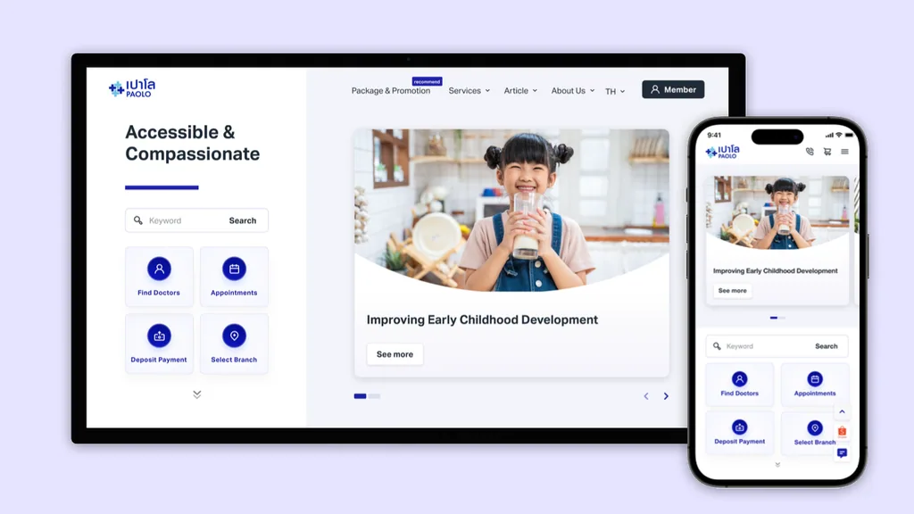
Paolo's promise is Accessible & Compassionate, and the home page had to make the first half of that literal — the four things a patient actually comes to do sit on the first screen, above everything else
Find doctors, appointments, deposit payment, select branch: four tiles, one tap each, identical on desktop and on a phone
Deep indigo on white, with a heavy rounded type for headings. Warm enough to read as care, plain enough to read as a hospital