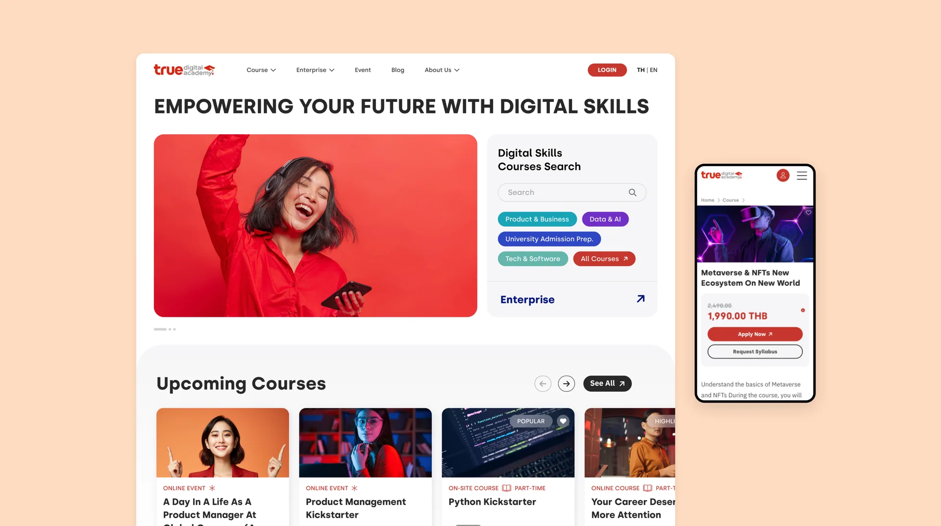
True Digital Academy on desktop and mobile, showing the course catalogue and a course detail page

A course catalogue that behaves like a storefront

Design and Development

  • True Digital Academy teaches digital skills, and the site had to do the job a prospectus does badly: help someone who does not yet know what they want to learn find the course they should take

  • So the catalogue leads, not the brand. Empowering your future with digital skills, then a search box and the four tracks — Product & Business, Data & AI, University Admission Prep, Tech & Software — before anything else on the page

  • Built mobile first. A course is something people look up on a phone during a commute and enrol in later, and the detail page carries the whole decision on one screen

A Catalogue That Sells

  • Every course carries its format on the card — online or on-site, part-time or full-time — because that is the constraint most learners filter on first

  • The detail page prices the course openly, shows the discount against the full price, and gives two ways forward rather than one: apply now, or request the syllabus for anyone not ready to commit

  • Upcoming courses and events share the same card language, so a free webinar and a paid course sit next to each other without one looking like an error

Two Audiences, One Site

  • Individual learners and enterprise training are different sales, and the site keeps them apart without splitting into two websites: Enterprise is its own top-level path and its own entry point from the search panel

  • Events and the blog carry the top of the funnel — someone arrives for a talk about product management and leaves knowing the academy runs a course in it

Thai and English, One Catalogue

  • Both languages run off the same catalogue rather than two sites kept in step by hand: the switch sits in the header, and every course carries its title, duration, format and price in each

  • Thai sets longer than English at the same size and breaks in different places, so the course cards and the filter panel are built around the longer of the two — switching language re-renders the words, not the grid

The True Digital Academy catalogue on desktop beside a course detail page on mobile

A Search That Follows

  • The search panel opens the course page rather than waiting to be found — someone who arrives without a course in mind meets the filters before the catalogue, not after scrolling past it

  • It filters on the three things that actually decide a course: topic, time commitment — workshops at 6–24 hours, part-time at 40–60, full-time at 140–480 — and whether it runs onsite or online

  • It does not leave with the results. Scrolling collapses it into a bar that travels down the page, so narrowing a search stays one tap away instead of a scroll back to the top to find the box again

The True Digital Academy wordmark in red, with its graduation-cap mark
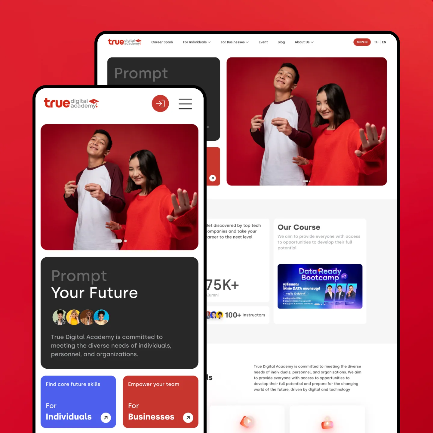
The True Digital Academy home page on desktop and on a phone against the brand red, the phone opening on Prompt Your Future
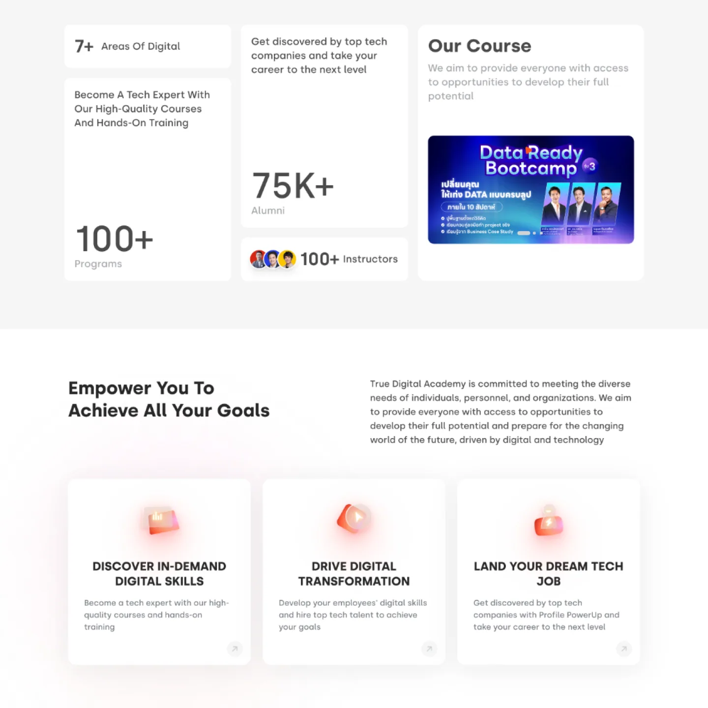
A close crop of the home page: tiles counting programmes, alumni and instructors, the featured Data Ready Bootcamp, and three reasons to study there
A hand holding a tablet open on the Thai-language page for businesses, which offers teams courses built to international standards
Let’s chat
COPYRIGHT 2022 (C) 5LAB COMPANY
CRAFTED WITHANDIN BANGKOK